Recently, I worked on a side project involving stock price prediction. The dataset included over 7,000 stocks, each with volume, open, close, low, and high values over 124 days. The task was to predict the stock prices.
The data is like the following:
| index | date | open | high | low | close | ticker |
|---|---|---|---|---|---|---|
| 0 | 2024-01-30 | 18.8 | 18.87 | 18.67 | 18.77 | EkEuXFUQrK |
| 1 | 2024-04-04 | 20.02 | 20.22 | 20.02 | 20.22 | EkEuXFUQrK |
| 2 | 2024-04-04 | 10.24 | 10.24 | 10.24 | 10.24 | ZL4m1dXqNc |
| 3 | 2024-04-03 | 10.3 | 10.3 | 10.3 | 10.3 | ZL4m1dXqNc |
| 4 | 2024-04-04 | 180.2 | 184.43 | 179.75 | 181.57 | 31cWpkAP9J |
| 5 | 2024-05-20 | 153.97 | 154.95 | 153.465 | 154.64 | KLZI5RbdeM |
| 6 | 2024-01-30 | 10.17 | 10.17 | 10.17 | 10.17 | ZL4m1dXqNc |
Data Cleaning
Steps
This is a typical time series prediction problem. The first step is to clean the data:
- Remove stocks with wrong price: Delete stocks where the close and open prices are not between the high and low prices, or where the high price is not higher than the low price.
- Handle Missing Dates: Identify and fill in missing dates to ensure continuity. The code for this step is:
df = df.reset_index() all_weekdays = pd.date_range(start=df['date'].min(), end=df['date'].max(), freq='B') df_reset = pd.DataFrame(index=all_weekdays) columns_of_interest = ['open', 'close', 'low', 'high', 'volume'] for column in columns_of_interest: pivoted_data = df.pivot(index='date', columns='ticker', values=column) pivoted_data = pivoted_data.reindex(all_weekdays) pivoted_data.columns = pivoted_data.columns + f'_{column}' df_reset = df_reset.join(pivoted_data) df_reset = df_reset.fillna(method='ffill').fillna(method='bfill')- This code is to create new rows for missing date, if there is no rows for those missing date. and fill in the missing value from the previous rows.
- It also re-organizes the data by date and ticker. Therefore, the data frame becomes:
date 00CqTIPkWB_open 00rG1ntZCy_open 01D9vjijJc_open 01JYWTck2S_open 02CJDrjOPG_open 02lB6TpAnx_open 03Y9Vmjntv_open 03hhtNepMx_open 04PdnOi6ep_open 04zCBWEeqA_open … zuABY45Hmn_volume zuMTVYqSCS_volume zuOGBEVxSJ_volume zwcn5c7GcS_volume zwvlwVkes9_volume zxZ2JdtJNr_volume zxh1cwiuqY_volume zxvRCQbTJl_volume zznnufCQ9n_volume zzvNRhUkJG_volume 2024-01-02 67.260002 2.75 11.80 3.93 6.41 4.000 20.600000 5.27 0.011 17.889999 … 66616.0 3466.0 68645.046875 4713264.0 109779.203125 3746.0 40389.0 2958.0 0.0 418608.0 2024-01-03 65.300003 2.77 11.80 3.98 6.22 3.960 20.080000 5.15 0.011 17.889999 … 65069.0 1170.0 60931.101562 3674418.0 107819.000000 29497.0 18171.0 1703.0 0.0 625632.0 2024-01-04 64.779999 2.72 11.80 4.04 5.63 3.688 19.520000 5.14 0.011 17.790001 … 72177.0 2111.0 65566.203125 2703312.0 75677.796875 38105.0 62145.0 1949.0 0.0 317535.0
Advantages Compared to the Original Dataframe
Easier Filtering: With the reorganized format, you can easily filter out stocks based on their ticker symbols. This makes it simpler to isolate and analyze individual stocks.
Time Series Visualization: The data is organized by date, making it straightforward to visualize the time series for each stock. This helps in identifying trends and patterns over time.
Compared to the original data frame, which has date and ticker columns in a table, the reorganized format allows for more efficient filtering and analysis of individual stocks over time.
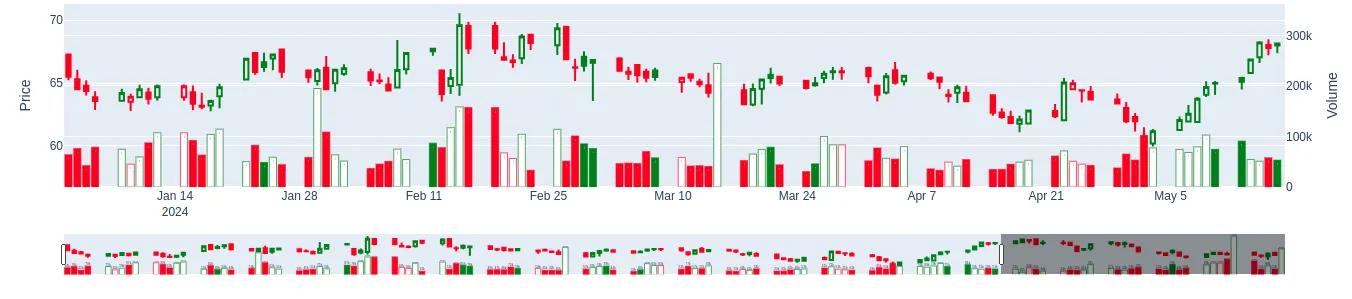
- Visualize it by Candle Graph
Based on the candle graph standard, we can randomly selected some stocks and visualize it by candle plot
import plotly.graph_objects as go
x = '00CqTIPkWB'
all_columns = ['open', 'close', 'low', 'high', 'volume']
x_pd = df_reset[[f'{x}_{i}' for i in all_columns]]
x_pd.head()

fig = go.Figure()
for i in range(len(x_pd)):
    fig.add_trace(
        go.Candlestick(
            x = [x_pd.index[i]],
            open = [x_pd[f'{x}_open'][i]],
            close = [x_pd[f'{x}_close'][i]],
            low = [x_pd[f'{x}_low'][i]],
            high = [x_pd[f'{x}_high'][i]],
            increasing = dict(line = dict(color = x_pd['color'][i]), fillcolor = x_pd['fill'][i]),
            decreasing = dict(line = dict(color = x_pd['color'][i]), fillcolor = x_pd['fill'][i]),
            yaxis = 'y',
            showlegend = False
        )
    )

    fig.add_trace(
        go.Bar(
            x = [x_pd.index[i]],
            y = [x_pd[f'{x}_volume'][i]],
            text = [x_pd[f'{x}_volume'][i]],
            marker_line_color = x_pd['color'][i],
            marker_color = x_pd['fill'][i],
            texttemplate = '%{text:.2s}',
            yaxis = 'y2',
            showlegend = False
        )
    )

fig.update_layout(
    yaxis = dict(title='Price'),
    yaxis2 = dict(title='Volume', overlaying='y', side='right')
)

fig.show()
Grouping Stocks
Methods
With over 7,000 stocks, it is essential to group them, then doing prediction fore every group. Based on Gemini suggestion, annual volatility and annual price are two features used for classification.
all_columns = df_reset.columns.tolist()
selected_columns = []
# Ensure 'close' is included (if not already)
for cc in all_columns:
    if 'close' in cc:
        selected_columns.append(cc)

# Select the columns from the DataFrame
close_xtrain = df_reset[selected_columns]
daily_returns = close_xtrain.pct_change().dropna()

annual_returns = daily_returns.mean(axis = 0) * 252
annual_returns.columns = ['annual_returns']

annual_volatility = daily_returns.std(axis = 0) * np.sqrt(252)
annual_volatility.columns = ['annual_volatility']


# Create a DataFrame with the data
data = {'annual_returns': annual_returns, 'annual_volatility': annual_volatility}
stock_data = pd.DataFrame(data)
Here I would like to recommand to use K-means and GMM methods to do groups:
- K-Means Clustering:
- Reason:
- Simple to implement and can handle large datasets
- Can used to identify the outliners
- Method: Use the elbow method to find the optimal number of clusters, then filter the outliners and group the data. The code is as follows:
 # features = stock_data[['annual_return', 'annual_volatility', 'vwdr']]
 features = stock_data[['annual_returns', 'annual_volatility', ]]
 wcss = []
 for i in range(1, 11):
     kmeans = KMeans(n_clusters=i)
     kmeans.fit(features)
     wcss.append(kmeans.inertia_)

 # Plotting the Elbow Method graph
 plt.figure(figsize=(8,5))
 plt.plot(range(1, 11), wcss, marker='o')
 plt.xlabel('Number of Clusters')
 plt.ylabel('Within-Cluster Sum of Squares (WCSS)')
 plt.title('The Elbow Method')
 plt.show()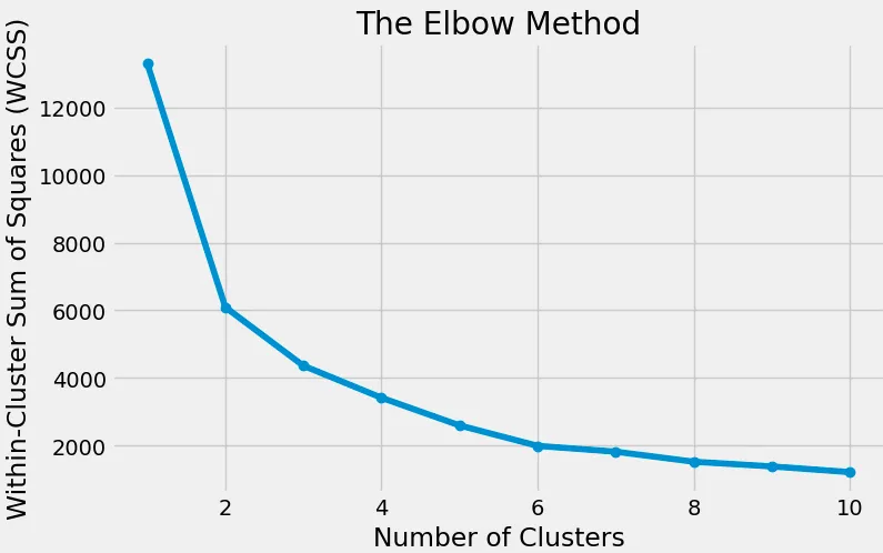
Here can filter the outliners based on
annual_returnsandannual_volatility:extreme_annual_returns = 15 extreme_annual_volatility = 30 stock_data_updated = stock_data[(stock_data['annual_returns'] <= extreme_annual_returns) & ( stock_data['annual_volatility'] <= extreme_annual_volatility )]then we set
num_clusters = 3. rerun the kmeans method to get the grouping result:kmeans = KMeans(n_clusters=n_clusters, random_state=random_state) stock_data['cluster'] = kmeans.fit_predict(features) # Plot clusters plt.figure(figsize=(10, 6)) plt.scatter(stock_data['annual_volatility'], stock_data['annual_returns'], \ c=stock_data['cluster'], cmap='viridis') plt.xlabel('Annualized Returns') plt.ylabel('Annualized Volatility') plt.title('Stock Clusters Based on Returns and Volatility') plt.colorbar(label='Cluster') plt.show()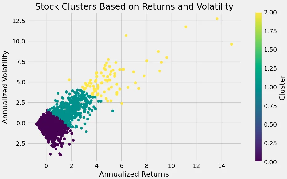
- Reason:
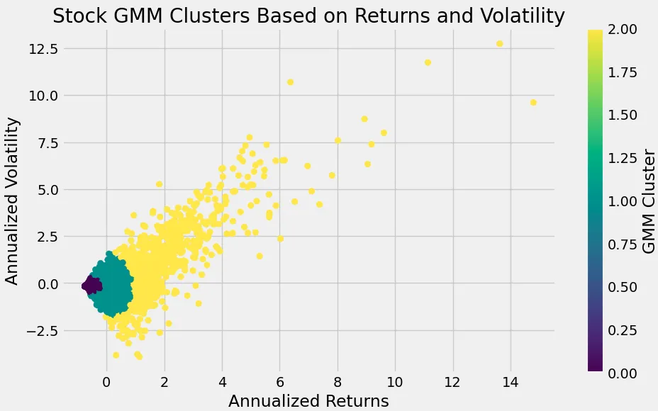
- Gaussian Mixture Model (GMM):
- Reason: Similar to K-Means but clusters data into ellipses rather than rectangles, based on mean, std and probability of this group.
- Result
Key Takeaways
- Data Cleaning: Ensuring data integrity by removing inconsistencies and handling missing dates.
- Data Visualization: Using candle graphs to visualize stock price movements.
- Clustering: Grouping stocks based on annual returns and volatility to identify patterns and make predictions.
By following these steps, we can better understand stock behavior and make more informed predictions. This approach can be extended and refined for more complex financial analysis and forecasting tasks.
Finally, save all the results and models for future reference and further analysis.
copied = stock_data_updated.copy()
copied.reset_index(inplace=True)
copied.iloc[:, 0] = copied.apply(lambda x: x['index'].split('_')[0], axis=1)

copied.set_index('index', inplace=True)
copied[['cluster', 'gmm_cluster']].to_csv('./data/grouped_stocks.csv')
Thanks for following along!